Objective
The objective was to pick and redesign a festival of choice and analyze what needed to be improved, then create a logo and come up with and design at least three touch points.

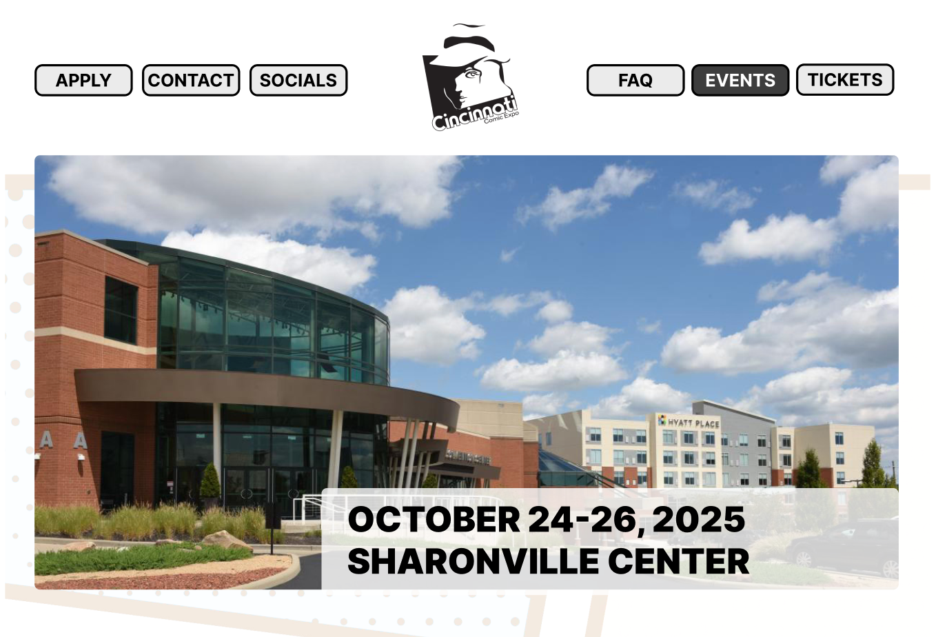
Festival Analysis
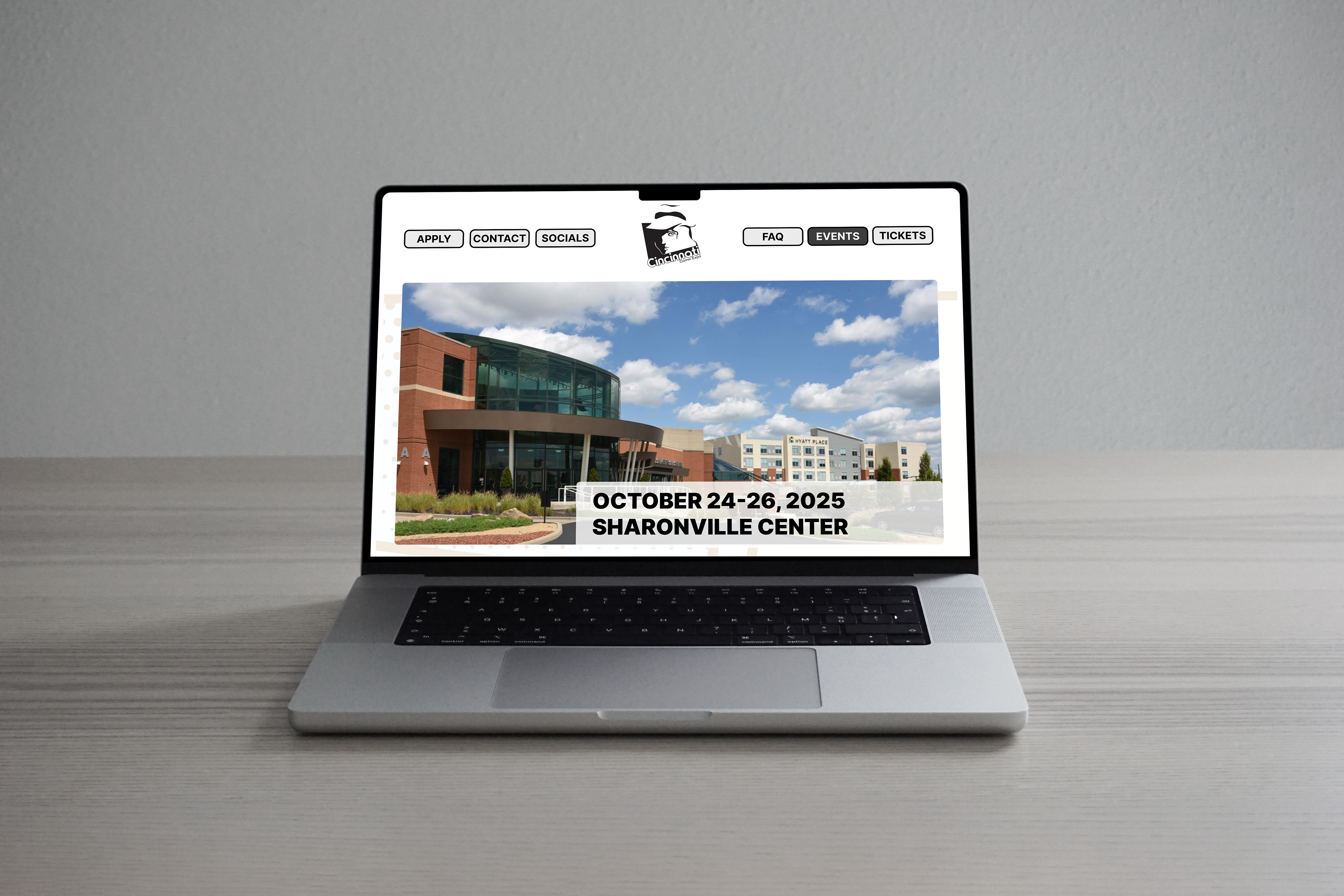
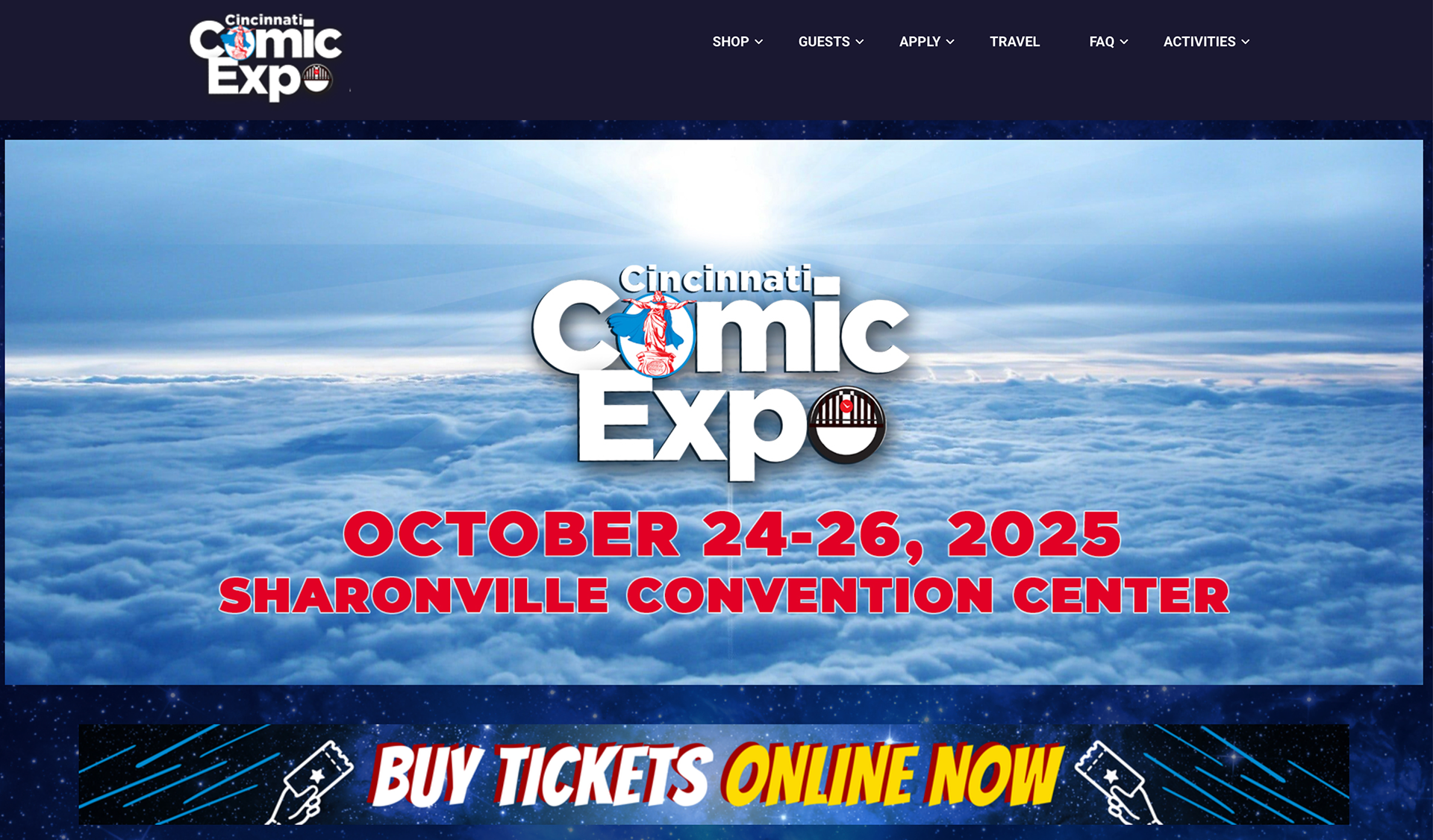
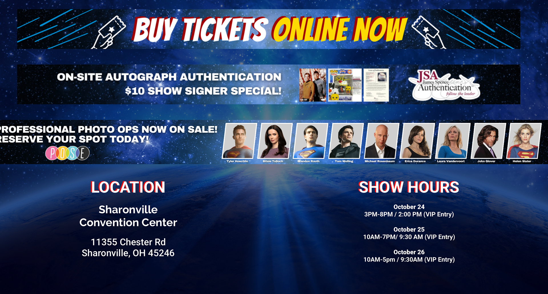
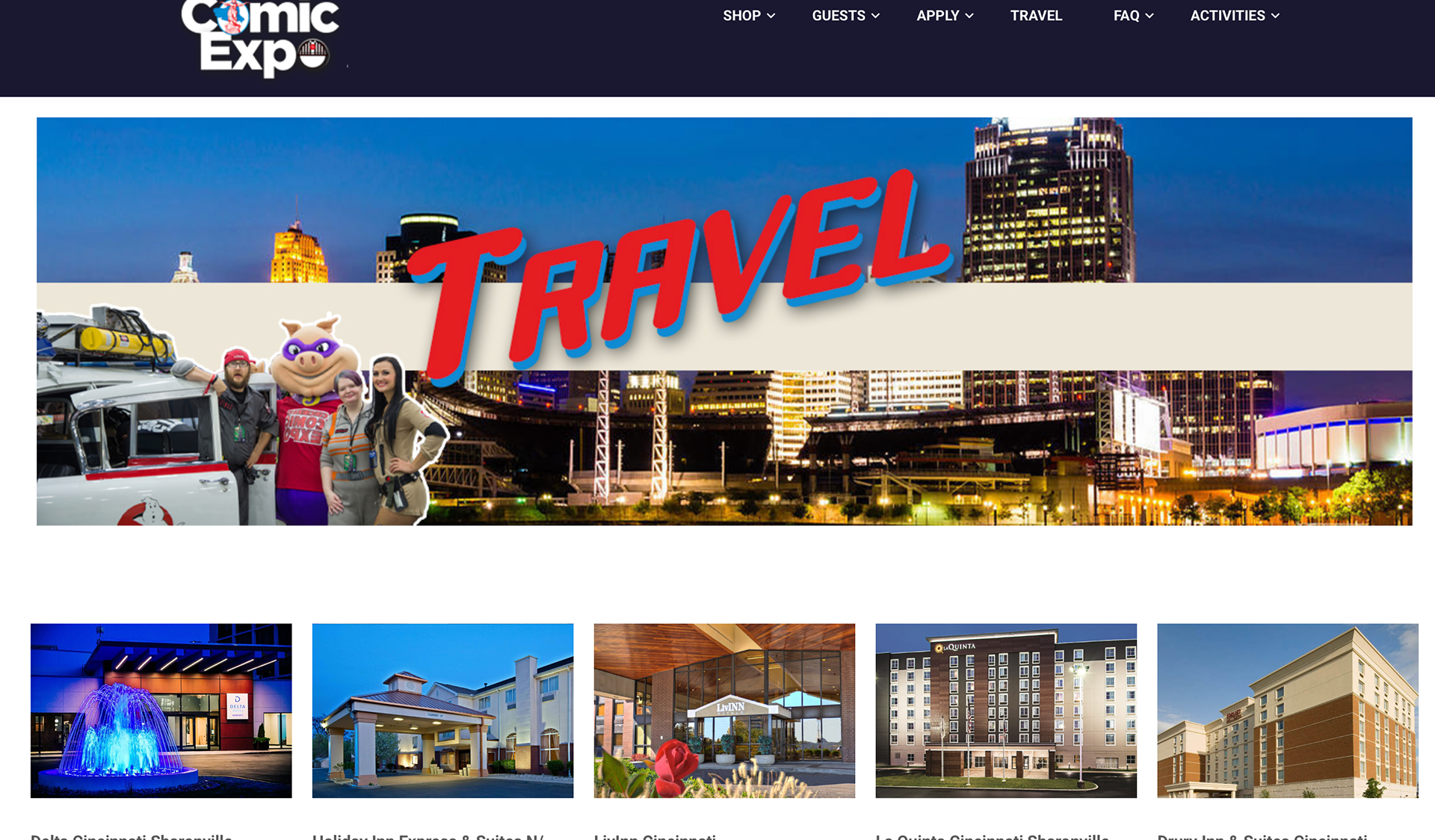
Logo and website are stylistically outdated. Website tends to repeat information and has an inconsistent type hierarchy.
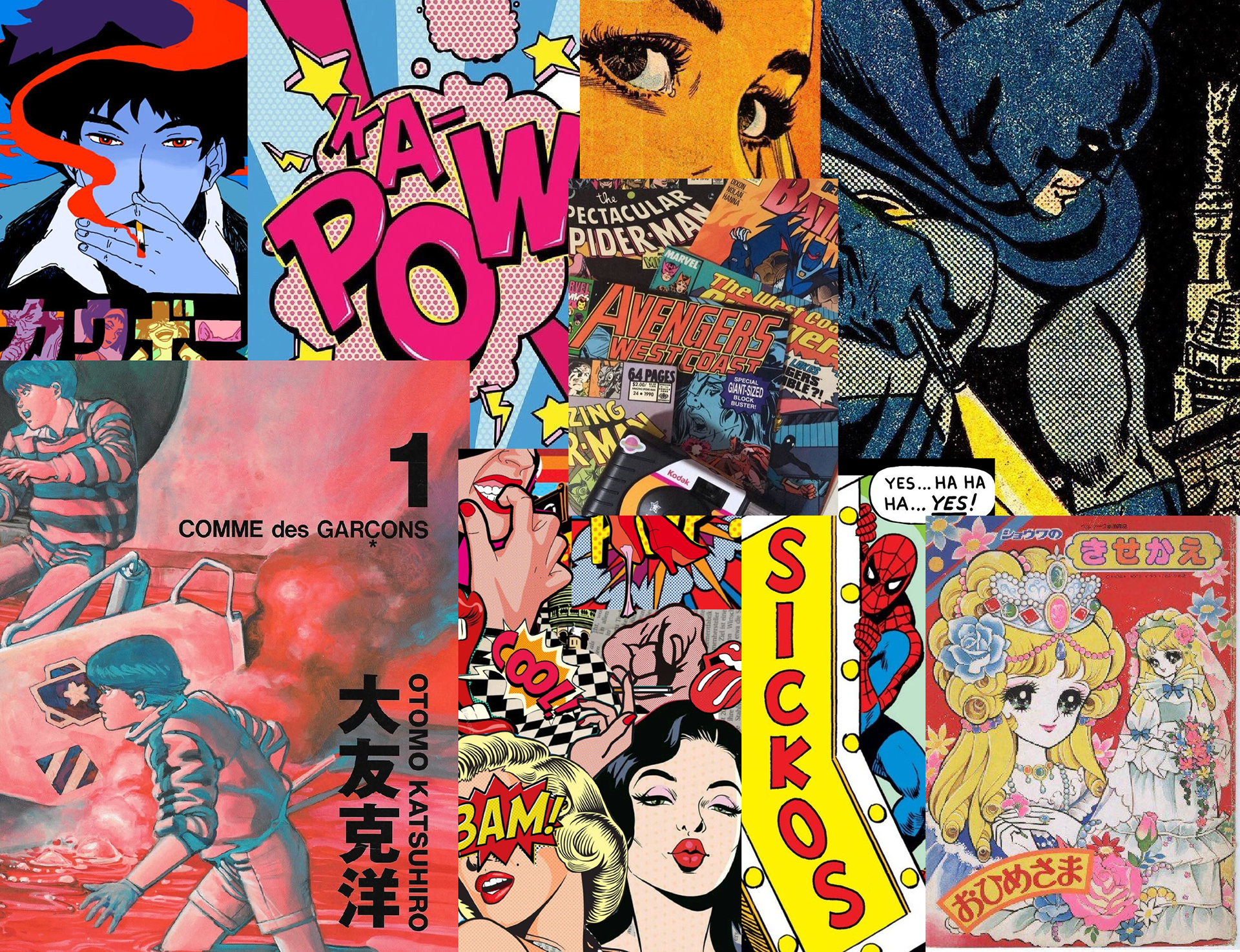
Inspiration Board
Took inspiration from both western and eastern comics in terms of art style and typography.
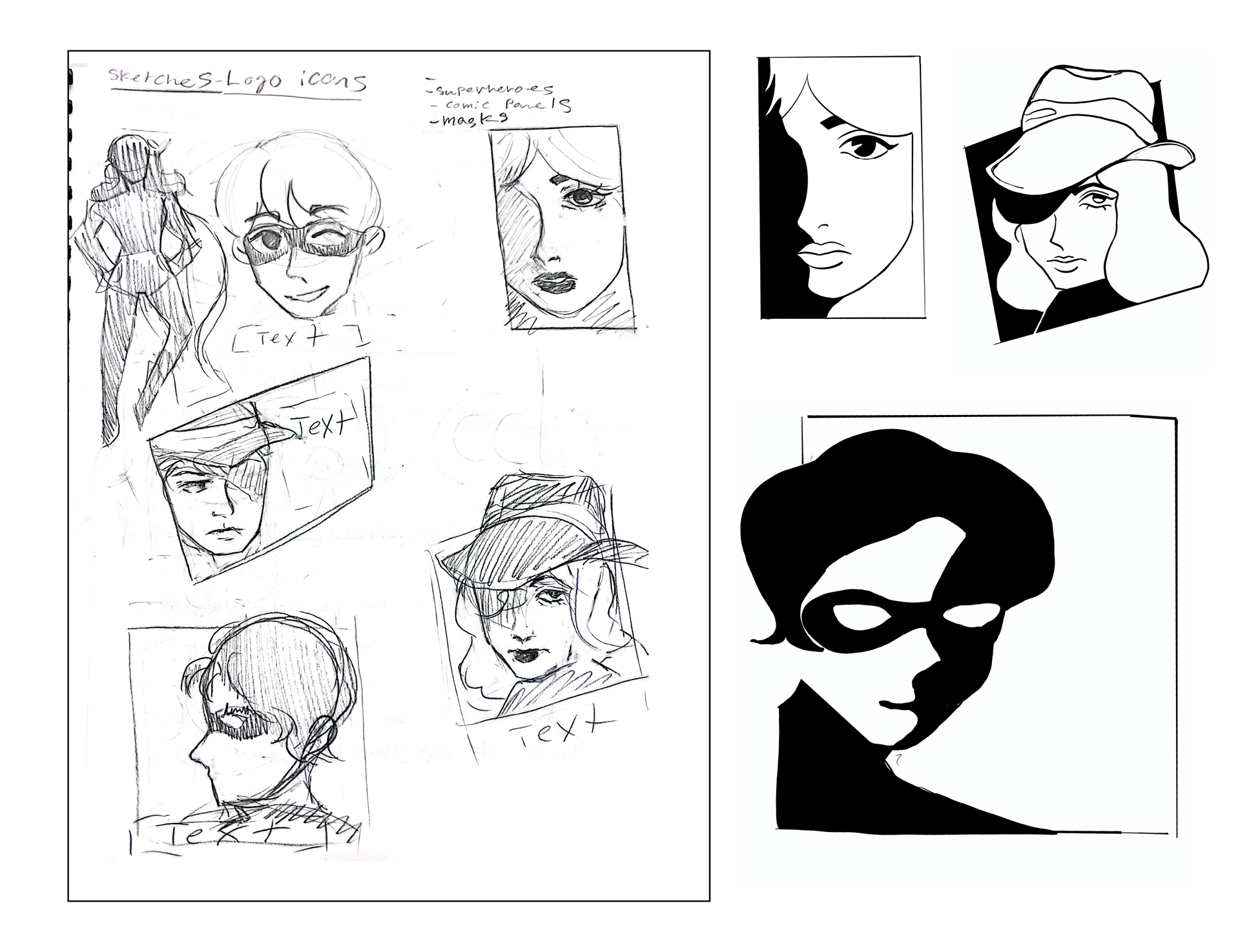
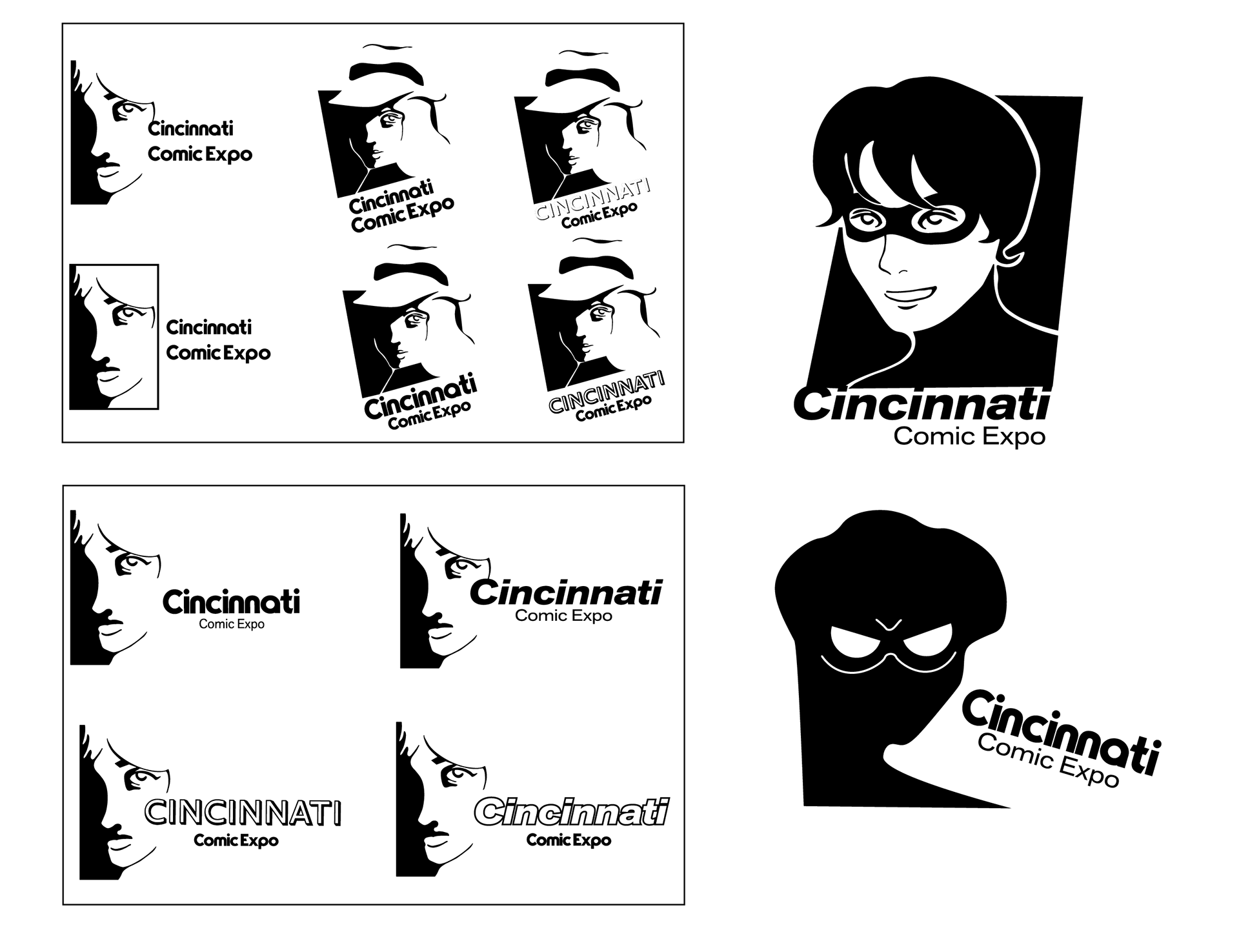
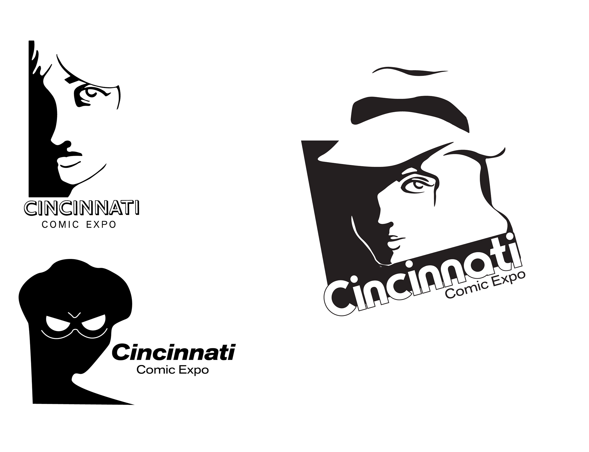
Ideations and Iterations
Sketches started traditionally, then moved to digital until three distinct directions remained.
Touchpoints
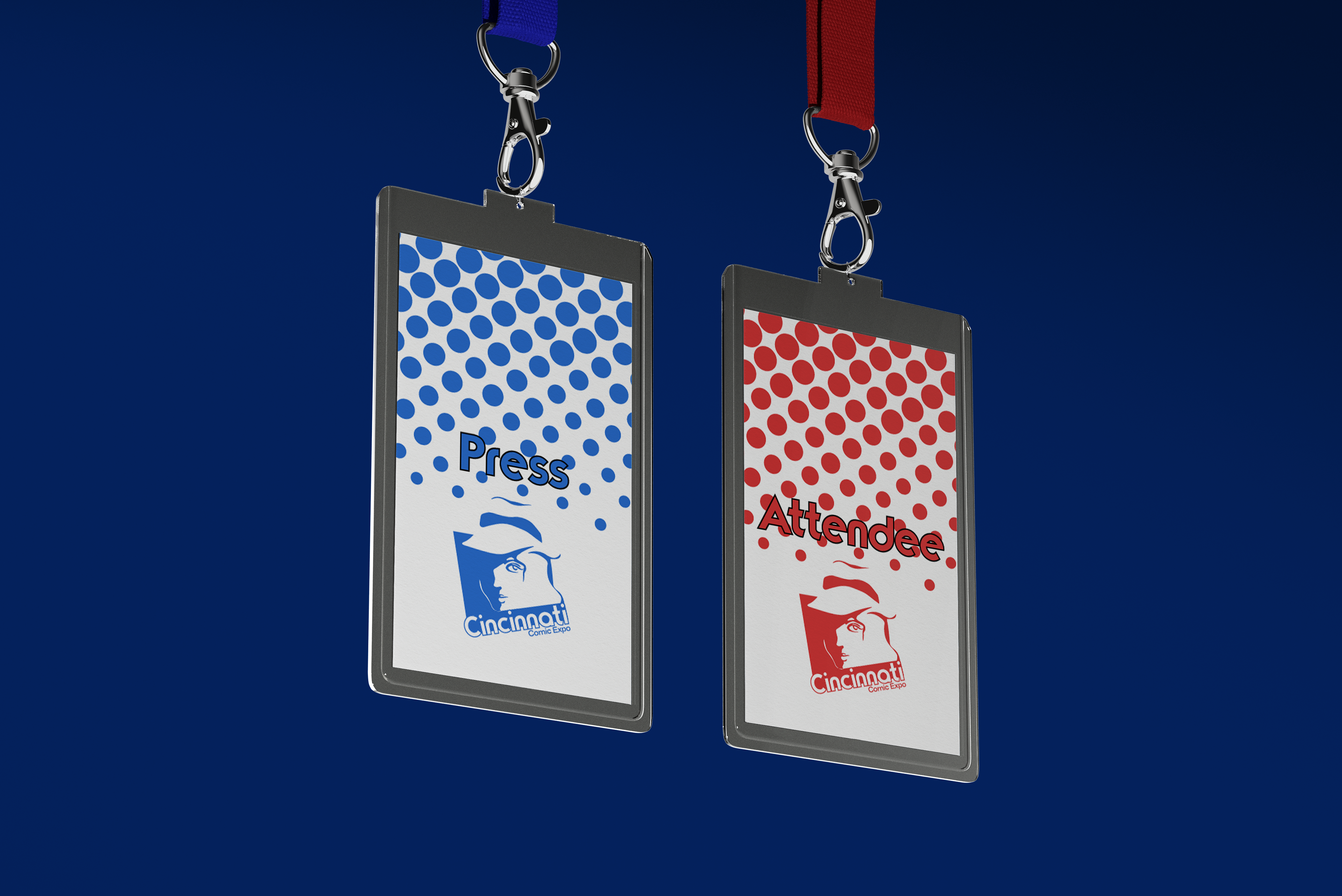
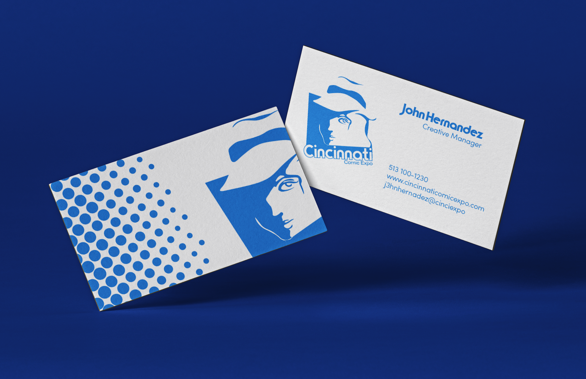
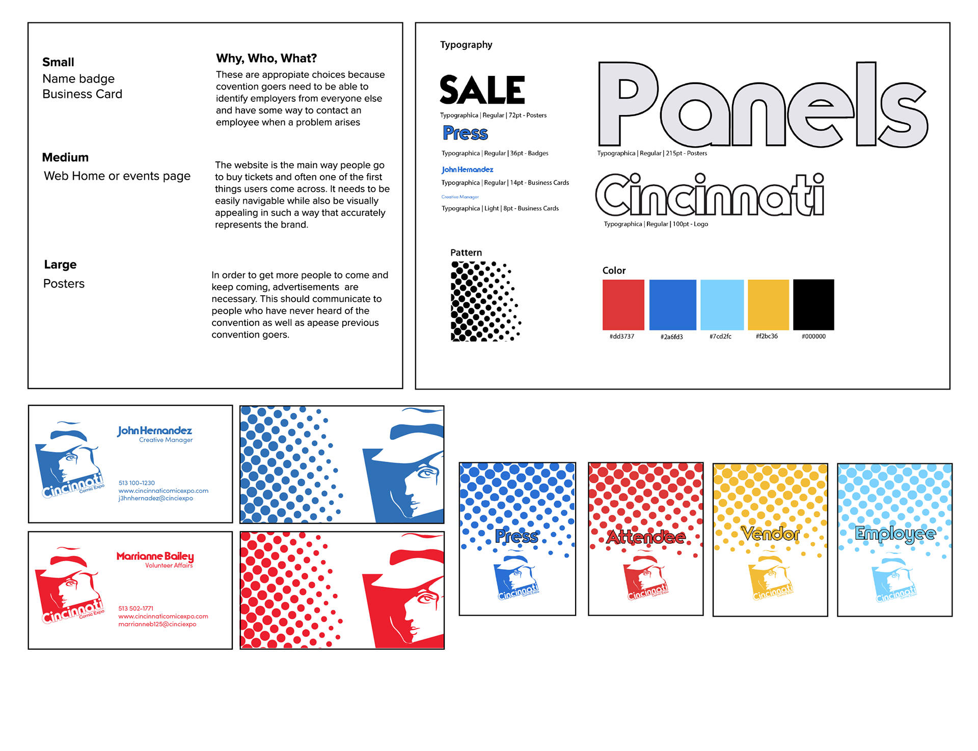
Colors for business cards and badges indicate different categories/departments.
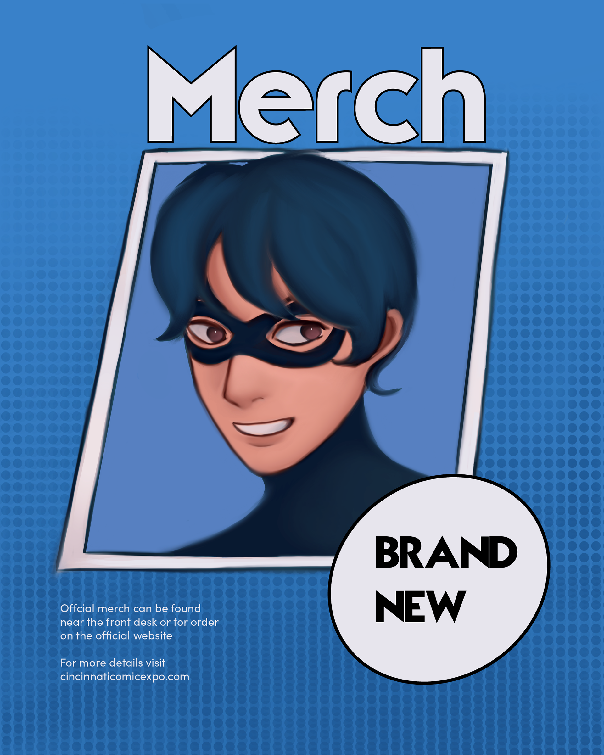
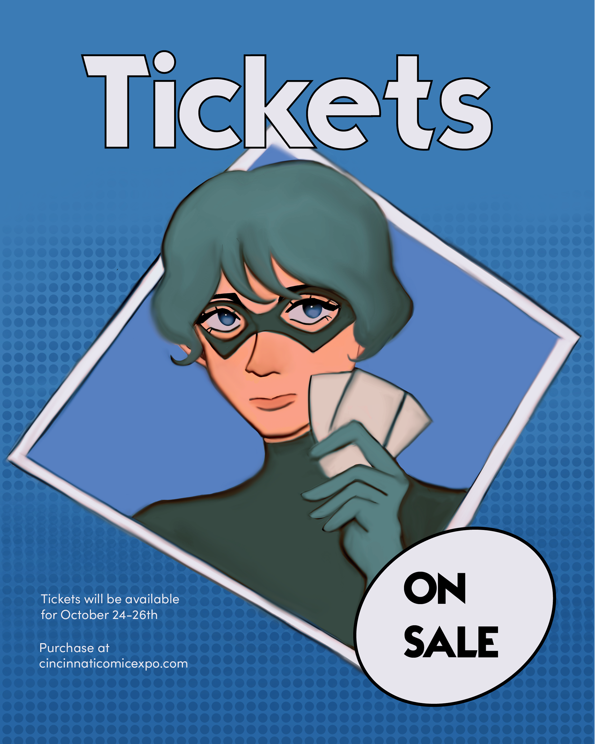
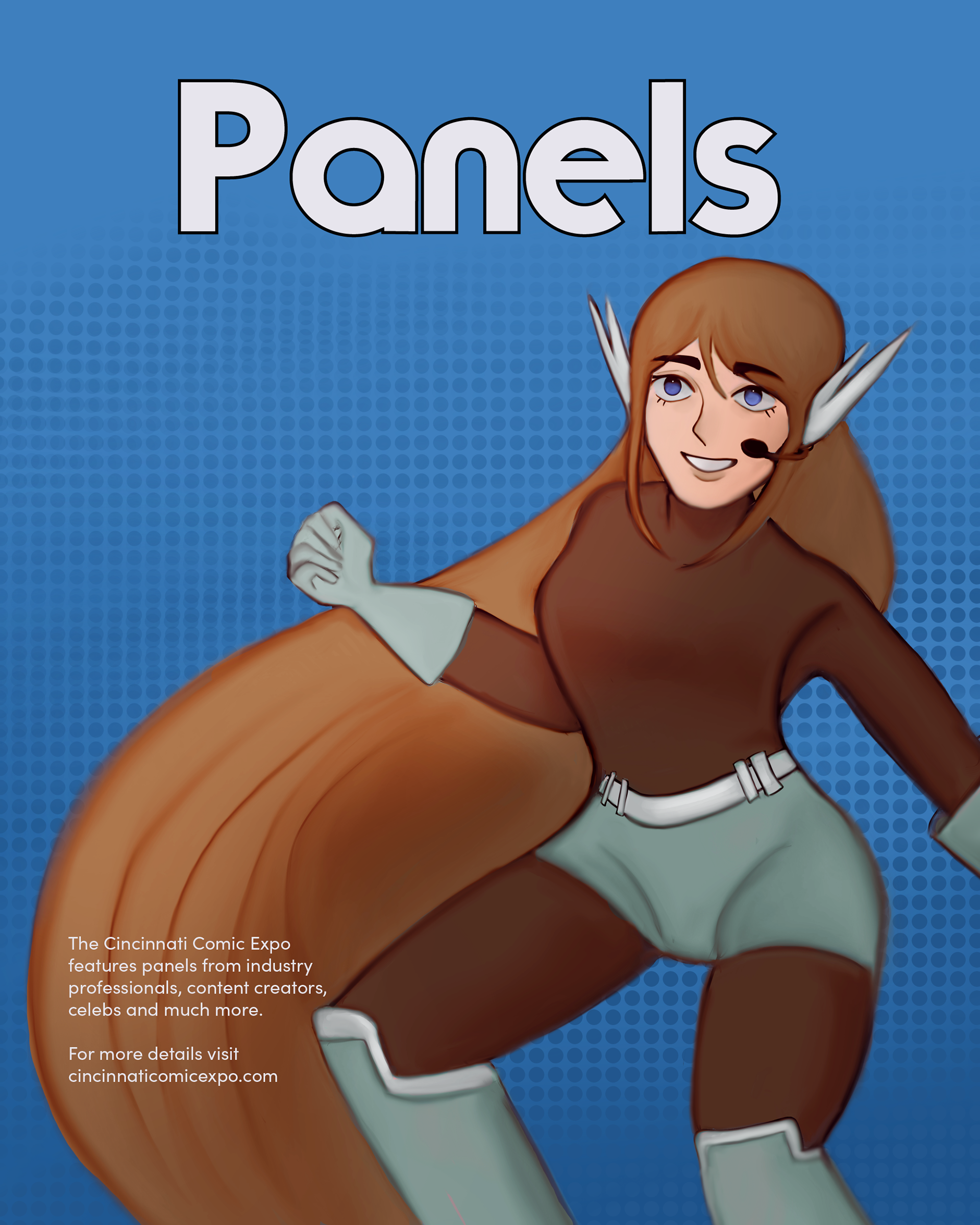
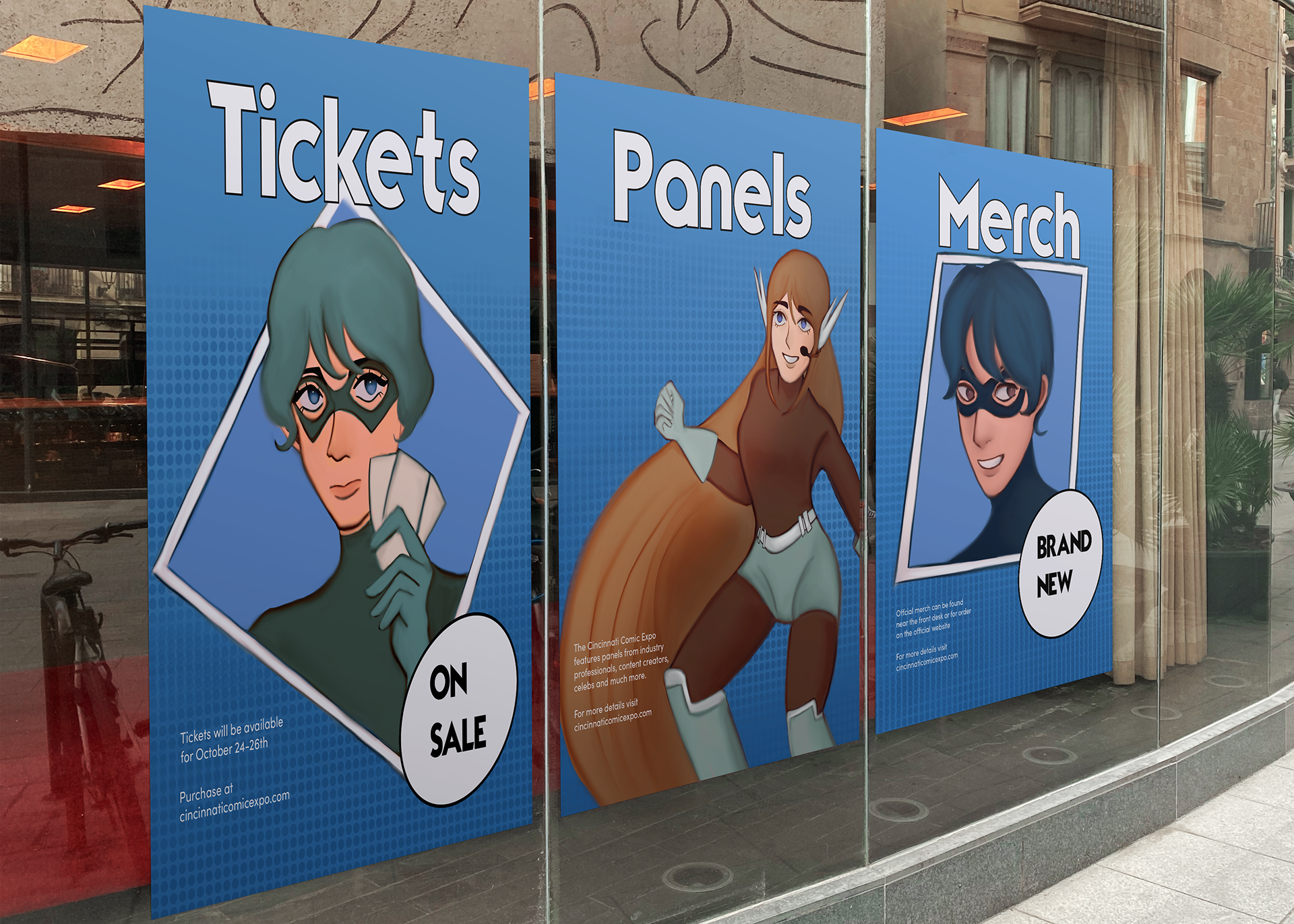
Collateral